four ways to include a hand drawn wedding venue illustration within your invitations
One of my absolute favourite things to draw is a venue illustration incorporated into a set of wedding invitations. It is such a unique touch, and it can really bring a suite together and get your guests ready for what you have in store. I draw the illustration by hand from photographs and then scan and digitise the drawing. The custom venue illustrations is then ready to be added to your printed wedding invitation suite as you wish. For inspiration, I have created a little guide to get your creative imagination flowing, and to show you four places you can use a venue illustration within your suite.
the main invitation
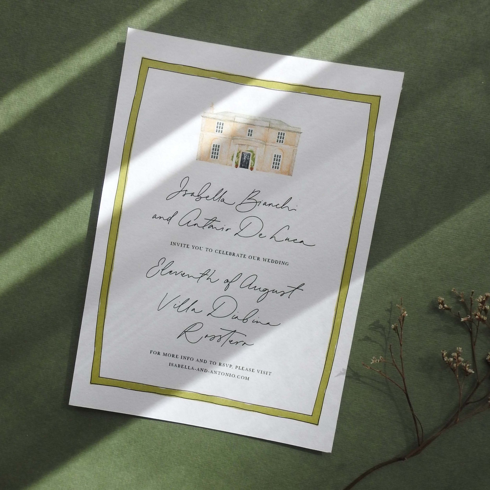
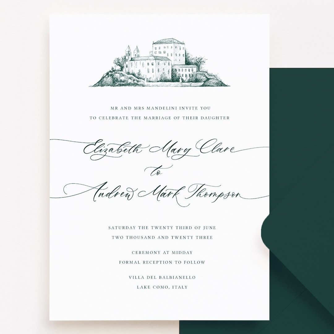
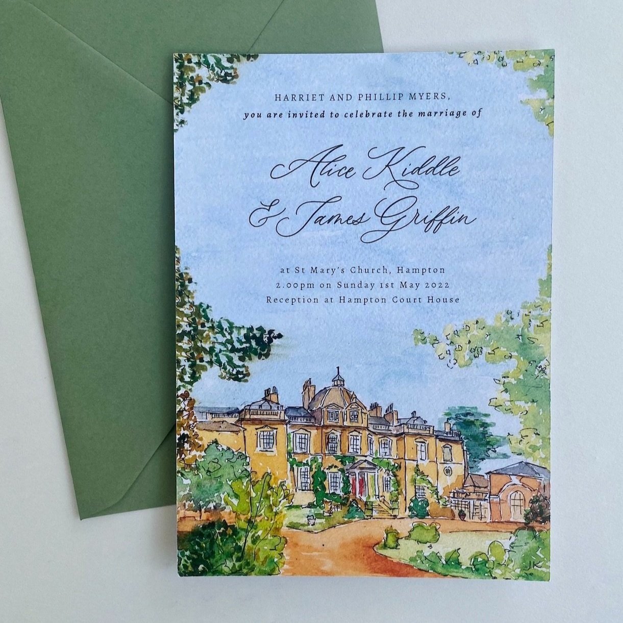
Let your venue illustration take centre stage by including it on your main invite. If you choose to include a venue drawing in your bespoke invitations, I will work with you to create an illustration that fits with your stationery moodboard and sets the tone for your wedding day.
You can also add an illustration to any invitation within my pre-designed invitation collection, although note that the suite is a great choice because it features very simple calligraphy and lots of negative space, so it isn’t too busy with an extra illustration.
envelope magic
Wedding stationers and designers love a bit of envelope magic - whether that’s beautiful handwritten calligraphy addresses, a colourful envelope liner, or a venue illustration right there on the flap.
Here, an illustration of the Orangery at Kew Gardens in London is accompanied with the couple’s initials and their wedding year, making for an impressive introduction to their wedding stationery.
Shown here as part of the BREEZE suite in the dusty rose colour palette.
wedding maps
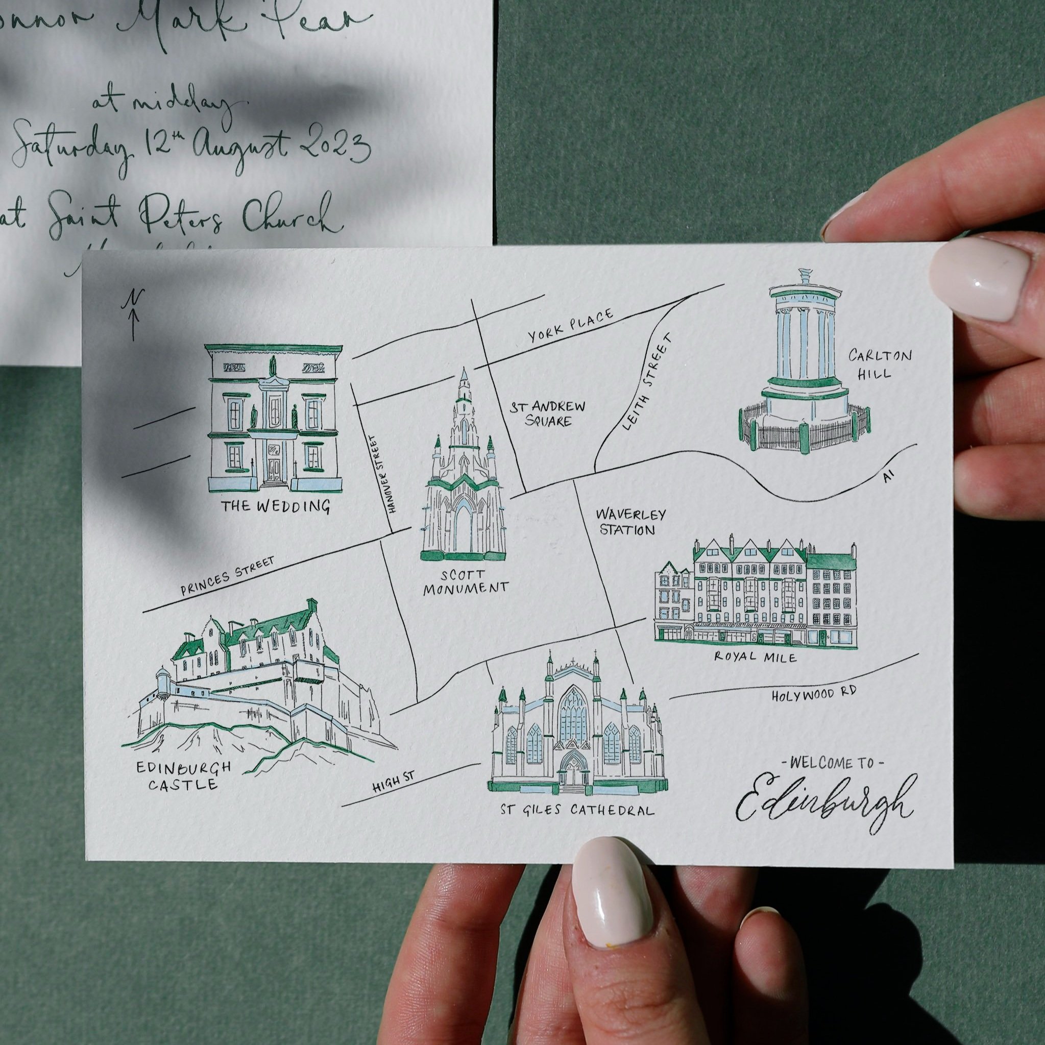
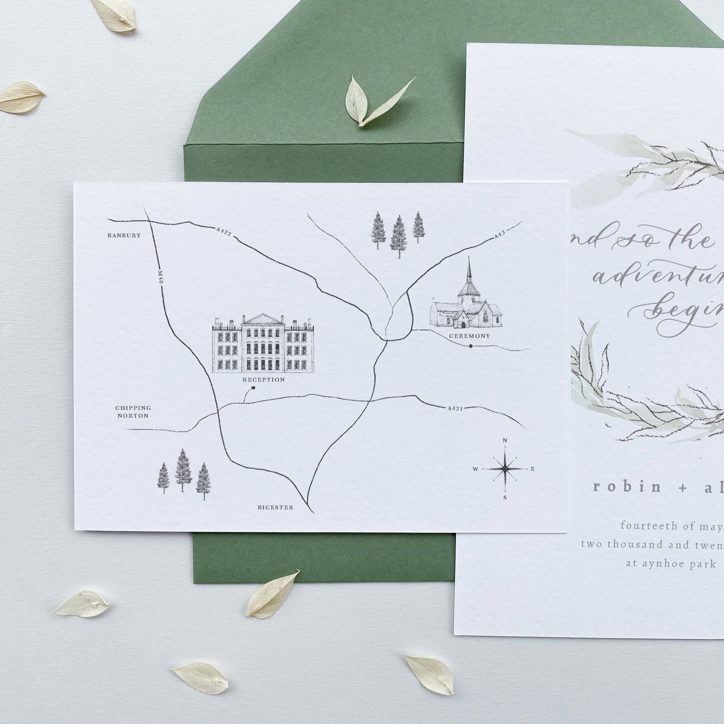
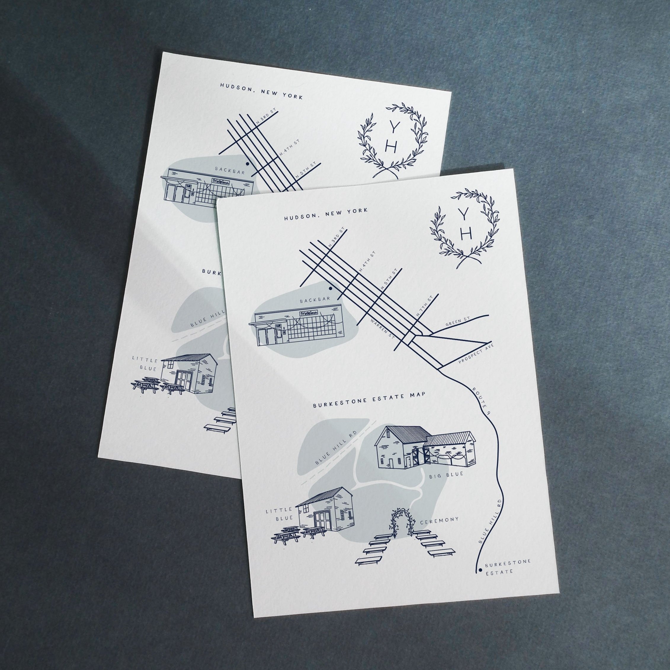
More than one venue? Guests have to navigate country roads between your ceremony and reception? Include a wedding map in your invitation suite as a useful guide to give your guests clear directions and make sure everything runs smoothly on the day. Maps can be styled to match the rest of your wedding stationery and colour palette. Read more about what information to include on your wedding map card here.
wrap it up
Last but not least, a venue illustration can be added to one of your finishing touches - such as a printed vellum wrap or a printed belly band. A great way of keeping all the lovely pages of your suite together and creating an impact upon opening.
Shown here on the INK suite in a sky blue colour palette.
Ready to create your own venue illustration for your invitations?
—> Add an illustration to your favourite design in the collection
—> Request a quote and tick the venue illustration box
—> DIYing your invitations? Purchase a digital drawing of your venue to print yourself
